Building a Fraud Dashboard in Looker Studio
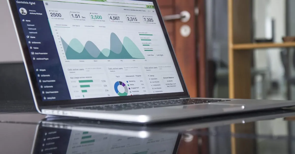
A fraud dashboard turns scattered order data into a single view you actually check. Here are the metrics worth charting, where the data comes from, and a simple layout you can build in Looker Studio this week.
Most stores discover fraud problems the slow way: a stack of chargeback notices, a payment provider warning, and a scramble to figure out what happened. A dashboard flips that around. When your fraud signals live in one visual, you spot the trend while you can still do something about it.
Looker Studio (formerly Google Data Studio) is a solid free choice for this. It connects to spreadsheets, BigQuery, and various connectors, refreshes automatically, and shares with a link. Here is how to build a fraud dashboard that earns its place in your morning routine.
Metrics worth charting
Resist the urge to plot everything. A dashboard nobody reads is worse than none. Focus on a small set of numbers that drive decisions.
Headline scorecards (top row):
- Chargeback ratio (count-based), with the current month against a rolling 90-day average.
- Blocked orders in the period, so you can see prevention working.
- Total fraud loss in dollars, including chargebacks plus refunds you attribute to fraud.
- Average order value of flagged vs. clean orders — fraud often skews high.
Trend charts (middle):
- Chargebacks over time, split by reason code (true fraud vs. friendly fraud vs. service issues).
- Risky-order volume by day, so you can correlate spikes with campaigns, sales, or fraud waves.
- Approval vs. decline vs. hold rates over time.
Breakdowns (bottom):
- Fraud by country / region, ideally on a geo map.
- Fraud by traffic type — VPN/proxy/Tor vs. residential.
- Top signals triggering holds, as a ranked bar chart.
That is roughly 10 tiles. It fits on one screen and answers the questions you actually ask.
Where the data comes from
A dashboard is only as good as its inputs. You will typically blend a few sources.
- Shopify order and transaction data. Export orders, financial status, and dispute records. Many teams pipe this into a Google Sheet on a schedule or into BigQuery for larger volumes.
- Payment provider dispute data. Your processor's chargeback records carry the reason codes and dates that Shopify alone may not expose cleanly. This is essential for the "chargeback by reason" chart.
- Fraud-tool signals. If you run a checkout-level filter, its logs are where "blocked orders," "risk scores," and "signal breakdowns" live. This is the layer that lets you chart *prevention*, not just losses.
For a store using Shieldy Fraud Filter, the block and risk-score data is exactly what powers the "blocked orders" scorecard and the "top signals" chart — you get to show the fraud you stopped, not only the fraud that got through.
The simplest reliable pattern for a small store: a Google Sheet with one tab per source, updated on a schedule, then connected to Looker Studio. As volume grows, graduate to BigQuery so refreshes stay fast.
A simple layout that works
Structure beats decoration. Use a three-band layout that reads top to bottom like a story.
- Band 1 — "Am I okay right now?" The scorecards. Big numbers, color-coded against thresholds. Green below a healthy chargeback ratio, amber approaching the danger zone, red past it.
- Band 2 — "Where is this heading?" The trend lines. This is where you catch a slow climb before it becomes a monitoring-program problem.
- Band 3 — "What's driving it?" The breakdowns by geography, traffic type, and signal. This band tells you *what to change*.
Add a date-range control and a couple of filters (by country, by product line) at the very top so anyone can drill in without editing the report. Keep the color palette to two or three colors; a rainbow dashboard hides the one red number that matters.
Practical build tips
A few things save hours of frustration:
- Standardize dates early. Mismatched date formats across sources are the number-one reason blends break. Normalize to
YYYY-MM-DDin every source tab. - Define "fraud loss" once. Decide whether it includes shipping, fees, and recovered amounts, then document it. Every number downstream depends on that definition.
- Use calculated fields for ratios. Compute the chargeback ratio inside Looker Studio rather than pre-baking it, so it recalculates correctly when you change the date range.
- Set a refresh cadence you trust. Daily is plenty for most stores. Real-time is rarely worth the complexity for fraud monitoring.
- Add threshold reference lines. A horizontal line at your danger threshold turns a trend chart into an alarm.
Making it a habit
The best fraud dashboard is the one you actually look at. Schedule an emailed snapshot to yourself and any co-founders, and put a five-minute dashboard check into your weekly routine. When a number crosses into amber, you investigate; when it hits red, you act.
Because the prevention data comes from your checkout-level filtering, the dashboard also becomes a feedback loop: tighten a rule, watch blocked orders rise and chargebacks fall over the following weeks. Plans start at Free ($0), scaling to Enterprise ($8.99/mo) and Shopify Plus ($16.99/mo), so you can start charting prevention data without upfront cost.
Build the ten tiles, wire up your three sources, and give yourself one screen that answers "is fraud getting worse?" before your payment provider does. Ready to feed it real prevention data? Check the pricing and start capturing the signals your dashboard needs.
Protect your Shopify store today
Install Shieldy free — block fraud, bots, and VPNs in under 5 minutes.
Install on Shopify — Free